MDES
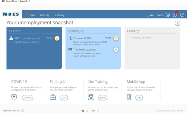
Developed state employment application including design, HTML using CSS, wireframes, mock-ups, Figma prototypes, AB testing, SEO. Development libraries.
(click image for detailed view)
Password: Mdes2021


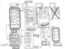
Design Process - Ideation
My approach to ideation varies depending on the project the logo, company colors, theme, and objectives all come into consideration when selecting the look and feel for an application.


Design Process - Color
Colors that are used throughout the application Usage of color is used based on its definition. This creates a flow of familiarity, done correctly an experienced user could navigate the application without needing to read a single word


Design Process - Font
The image depicts the areas the font is used, the size of the font for those uses and whether the font is bold block or image based . Like Color font usage can make navigation and overall use of an application seamless


Design Process - Indentation & Spacing
Indentation and headings between the heading and body test are to be consistent


Design Process - Icons
Depiction of form style and spacing
Design Process - Forms
Create a directory with all of the icons being used for future reference


Design Process - Logos & Banners
Branding
- Large Banner Logo
-Small Logo
-Icon Logo


Design Process - Interactions
Used to engage information on the page interactions may change in color shape size or visibility to display the manipulation of an element in a specific manner


Design Process - Overlays & Pop-ups
Overlays used for such notifications as tooltip information, prompts, and extra activities the user may have to complete that are not apart of the high frequency flow


Design Process -Lists & Tables
Look and feel may vary these are used to display multiple sets of data including dates, addresses, names, and financial data.


Design Process -Header & Footer
Headers and footers should be on all pages. The header should remain fixed at the top of the page when scrolling. In case of mobile orientation the text can be reduced to a hamburger menu.


Design Process -Breakpoints
Usually broken into sections of 8 or 12 breakpoints provide screen size transitions that generalize from desktop to tablet and tablet to mobile. Smooth transitions result in a responsive design


Initially everything starts off with a happy path however the error message is necessary for those not so happy moments where the user veers off into the beaten path the look and feel of the error messages with colors consisting of red yellow and orange are a necessary staple in an application that can help the user complete his task with minimal missed entries
Design Process - Error Messages


MDES – Mississippi Department of Employment Services

Lorenzo Intisaar Design
Explore the sleek and minimalist portfolio showcasing the UI/UX design aesthetics of Lorenzo D Intisaar.
Contact
Services
info@lorenzointisaar.com
818-272-6313
© 2024. All rights reserved.